Insights Hub IH Monitor - Timeseries data visialization
2024-02-19T08:55:10.000-0500
Applications
Summary
timeseries data visualization, wrong scaling, dotted lines, null variables, no variables displayed, 90 days error message, please reduce time range below 90 days
Details
Based on Insight Hub Monitor Timeseries Data Visualization Area:
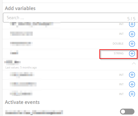
In case the variables are not displayed when using aggregates, please make sure that the variables are not a string type. Based on IoT Time Series Aggregates Service, the IoT Time Series (TS) Aggregates Service creates aggregated summaries of numeric time series data:
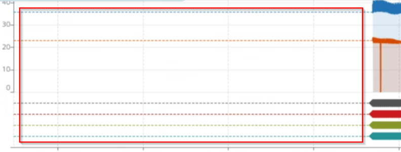
- By default, "Aggregates" view is selected with "Last hour" time period. The dotted lines in the "Raw" chart represents additional data. You can Zoom-in or scroll the cursor in the chart to visualize additional data.
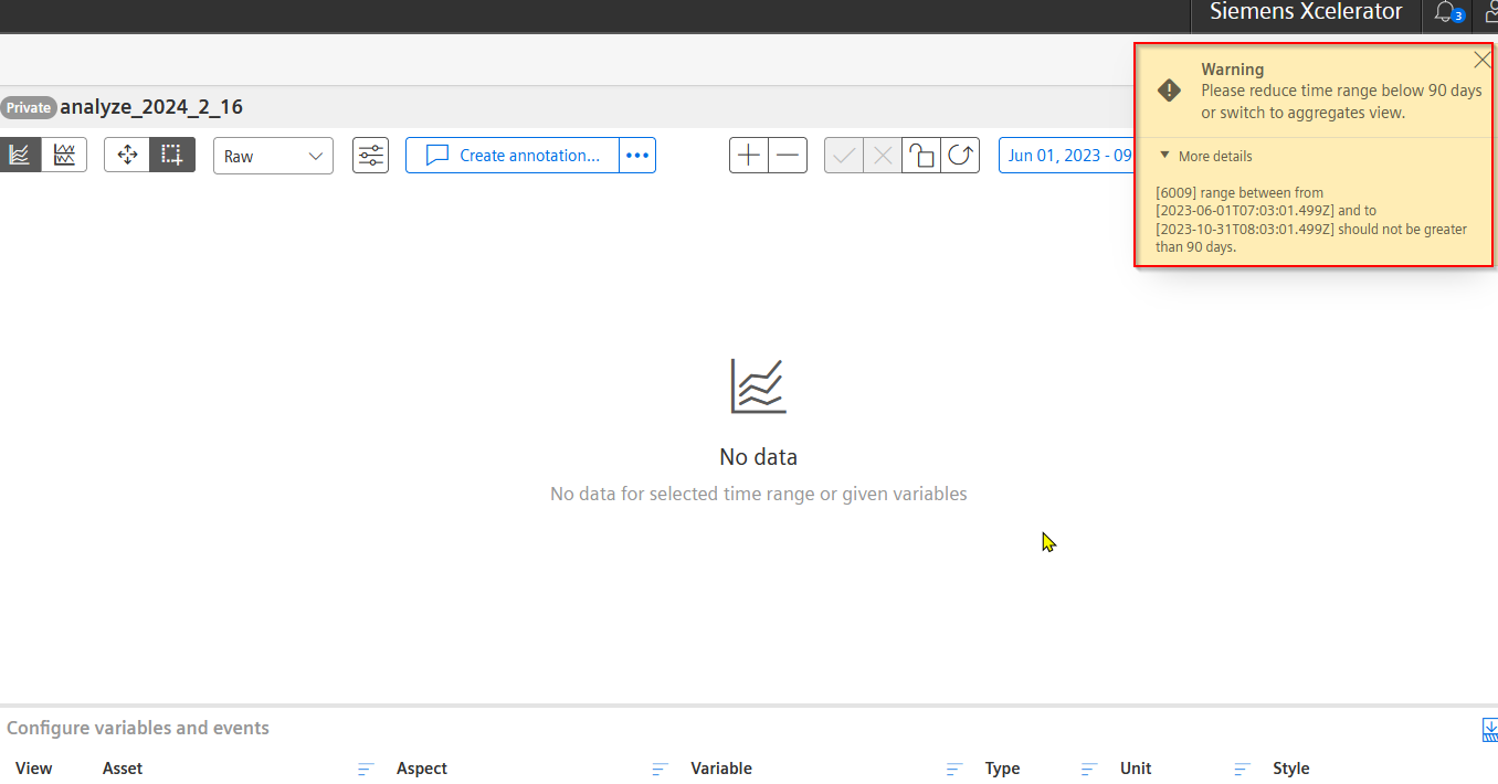
- In "Raw" chart, if the time period exceeds 90 days then below error message is displayed and will you have to reduce the time period below 90 days. It also allows you to switch between Raw and Aggregate view: "Please reduce time range below 90 days or switch to aggregates view."
In case the variables are not displayed when using aggregates, please make sure that the variables are not a string type. Based on IoT Time Series Aggregates Service, the IoT Time Series (TS) Aggregates Service creates aggregated summaries of numeric time series data:
Related information
please also have a look at Insights Hub Monitor Limitations
please also have a look at Insights Hub Monitor Limitations